Chapter 5 Results
5.1 Obtain the Covid Data & Time Series Data
we load the confirmed_TS and death_TS dataset which we prepared in the previous part
5.2 Time Series Plots for State Covid Confirmed and Death Cases
For most of the states in November, the number of confirmation cases is between 0 to 0.4 million. The confirmed cases of COVID-19 along the time is like exponential growth for Texas, California, Florida and Illinois, with 0.7M to 1.3M confirmation cases, which are the states with the highest confirmation cases currently. Other states look more like a S-shaped curve. But when zooming the graph out, we can find that starting from November, the cases are showing as an exponential growth again.
There is a cross among the first outbreak states and the later outbreak states in June and July. After these months, California, Texas, Florida and Illinois have a higher exponential rate than the first outbreak states NJ and NY. The reason why NY and NJ got first breakout may be due to the highest density of population and a busier transportation system.
The death cases’ patterns are similar as the confirmation cases’, excluding the fact that NY, NJ reversed the position with Texas, California, Florida and Illinois. The Death rate of NY is always the highest, this may be due to the shortage of medical resources and lack of treatment experience at the first breakout and death rate is not reversible.
For most of the states in November, the number of death cases is between 0 to 10k. In November, NY has the highest death cases with 35k, and then Texas, California, Florida and NJ have around 17k. Most of other states have S-shaped curve. When zooming the graph out, we can find that starting from November, the cases are showing an exponential growth again.
5.3 Time Series Plots for State Covid Confirmed Rate and Death Rate
Observe that the states that got the first outbreak, like New York and New Jersey, showed a slow growth curve at a later time. But the states that didn’t get a severe situation at first, growed in a more scary way at a later time, like North Dakota and South Dakota. This may due to the guarding down during the good performance at the first outbreak period.
We thought California had the highest confirmation rate by Nov 30th since it has the highest confirmation cases. However, we just found that North Dakota and South Dakota got much worse confirmation rate with a smaller population. You can compare the North Dakota to California by clicking on the two states with the interactive Plotly plots to see these two only in one graph together.
In addition, by observing the growth curve, we found that most states did a good job on controlling the confirmation rates from May to September with lockdown policies. But approaching the vote period October and November, the confirmation rate went back to exponential growth again and was out of control for most of the states, even for New York. The ignorance of the covid during the selection period maybe the reason why this phenomenon occurs.
The most shocking finding is that New York and New Jersey has the highest death rates among all the states even after the first outbreak, but they have almost the best medical equipment and resources. However, considering the low confirmation rate of these two states, that doesn’t mean that patients die more. On the contrary, we found that the slopes of these two states are lower than other states in the 2nd and 3rd outbreak until November.
The current high death rate of NY and NJ is highly likely the accumulated results from the first outbreak when the medical resources are lacking and the production of medical resources’ capacity didn’t catch up well. At the same time, the confirmation cases didn’t go up very much, therefore the death rate wasn’t diluted.
5.4 Are Cities more Vulnerable?
Due to the fact that Covid-19 spreads fast in the area where lots of people are gathering, some may believe that cities are more vulnerable than the rural areas. We want to verify the validity of this claim. Here, we assume that counties with large population size are “cities” and others are “rural areas”.
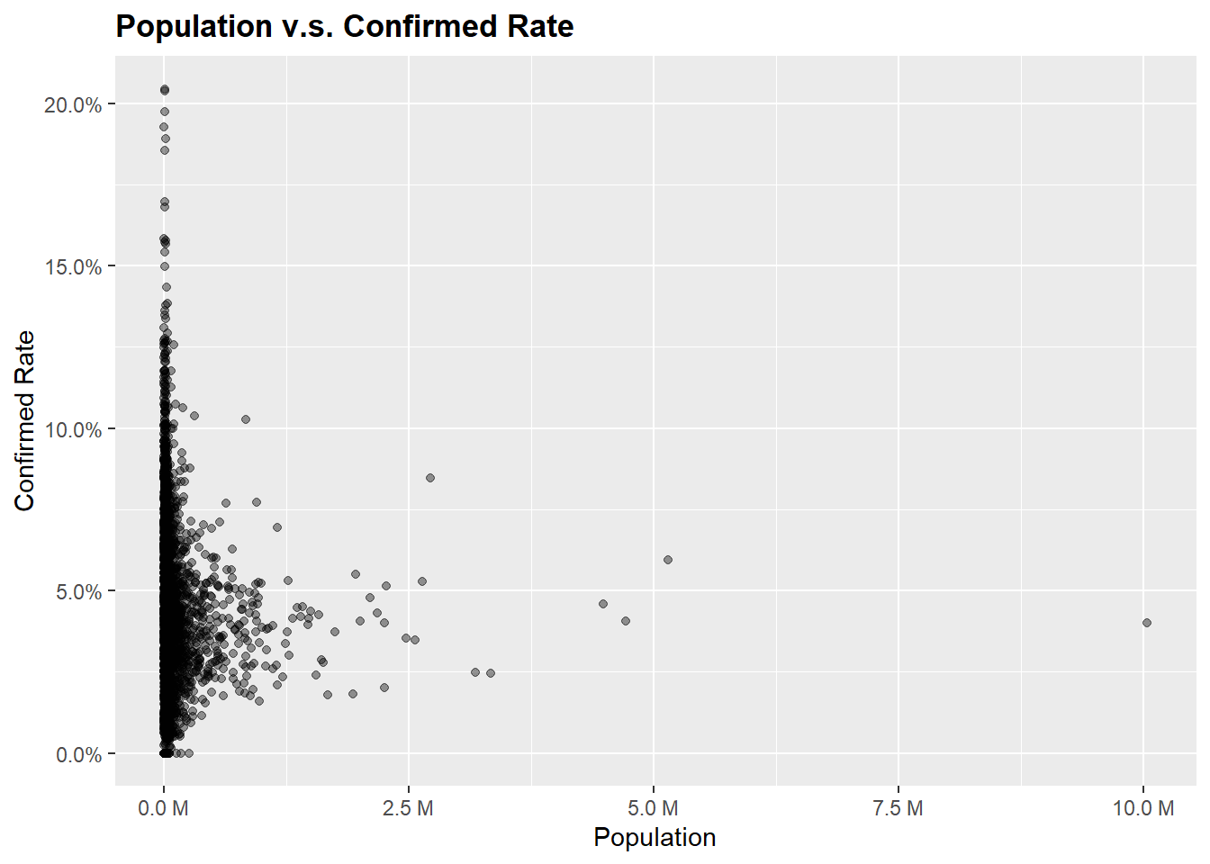
We see that for counties with large population, the confirmed rates are not relatively high. For instance, the Los Angeles County (the one near the right verge) has over 10M population, but the confirmed rate is actually relatively low. Some counties have very low confirmed rate and others have a confirm rate of over 10%, but these counties all have very small population. Thus we suspect that the distribution shown is a result of high variability. But due to the overlaps, we are not entirely sure from this graph how well large population counties do compare to small population counties. Thus we define large population counties to be those counties with over 1M people. Then we draw a boxplot faceted by population size.
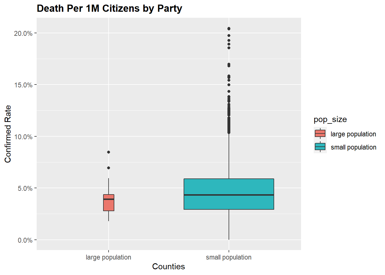
Here is much clearer that cities are not more vulnerable. So what shapes our perception is probably due to the fact that these places have more people to begin with. We might want to report an area which has a high number of confirmed cases, but it does not mean that it is easier to get infected there.
5.5 Covid & Election & Health Expenditure
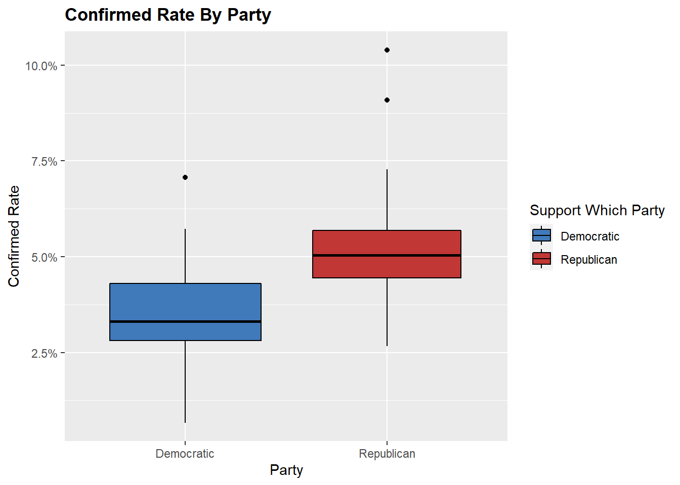
From the first boxplot, there is clear evidence that on average, the states that vote for the Republican Party has a higher confirmed rate than those who vote for the Democratic Party. The median confirmed rate for a democratic state is approximately 3.0%, whereas for a Republican State, the median jumps to around 5.0%.
The one outlier within the Democratic state is shown here: `
##       state confirmed_rate Biden Support Rate
## 1 Wisconsin     0.07071441          0.5031906
Notice that even Wisconsin is a “Democratic” state, it is fairly divided. A state is “Democratic” as long as more than 50% of the votes goes to Biden. It could be 51% or 80%. We hypothesize that the support rate does make a difference. Namely, we suggest if a population resonates more with Trump, then it would potentially suffer from a higher confirmed rate.
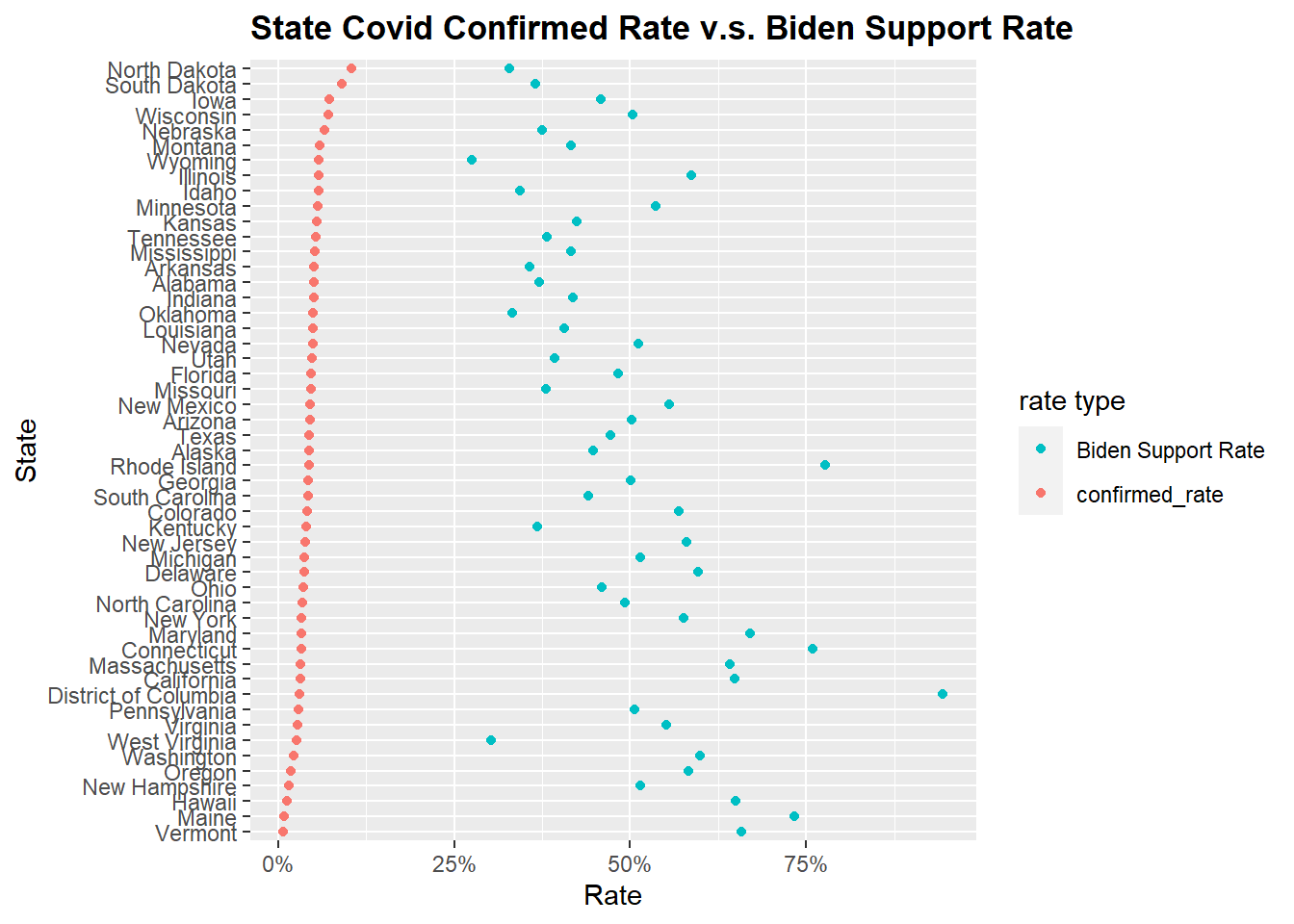
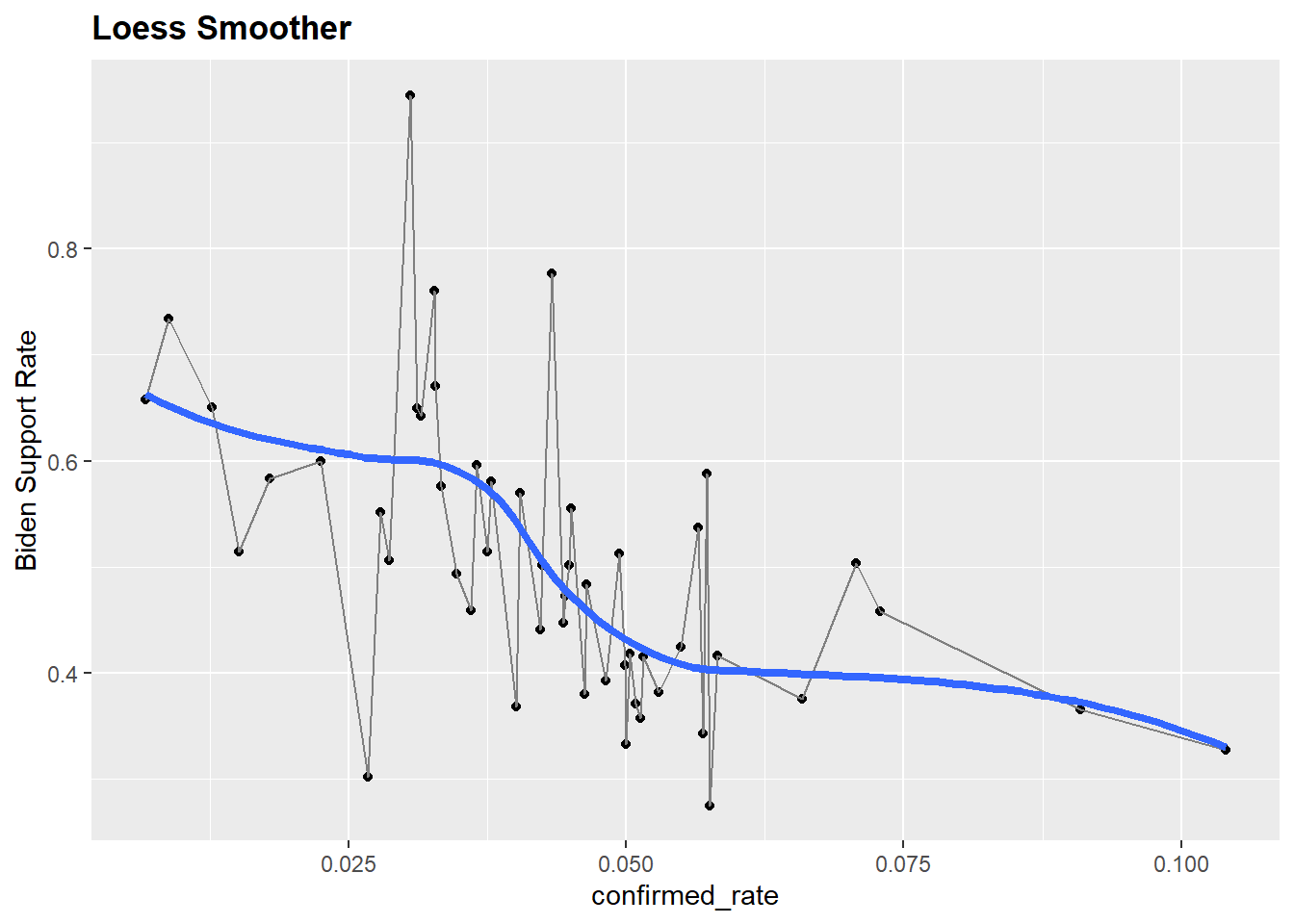
It looks like there is a negative association between Covid-19 confirmed rate and Biden Support Rate from the first plot. Biden seems to earn less support in the states where the covid confirmed rate is higher. We would like to explore this relationship a little bit more using a scatter plot. Specifically, we would like to see how the difference in support rate correlates with the confirm rate.
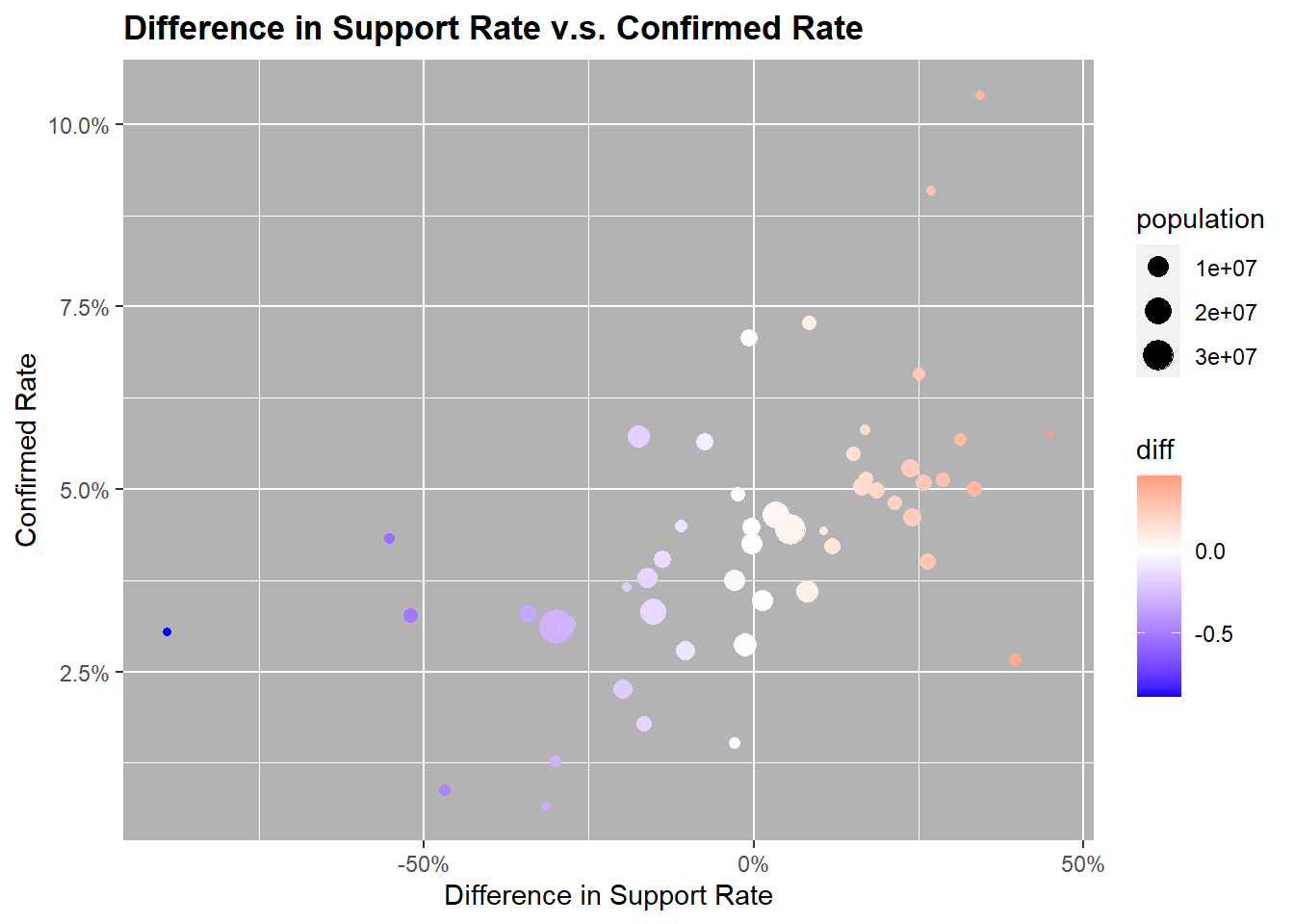
In this plot, the higher the Difference of Support Rate or the closer the dot is to the right verge, the more the state leans towards Trump. For example, if x=-50%, then 75% of the votes went to Biden and 25% of the votes went to Trump. The divergent color scale just made the graph easily interpretable.
Here we can see much clearer that higher Trump support rates tends to associate with higher confirmed rates. Most states with a confirm rate higher than 5% lean towards trump, whereas all of the states with a confirm rate below 2.5% lean towards Biden.
Another interesting non-covid related observation is that there seems to be a negative association between population size and unifiedness. In other words, the higher the population, the more likely that the state is divided, which makes sense.
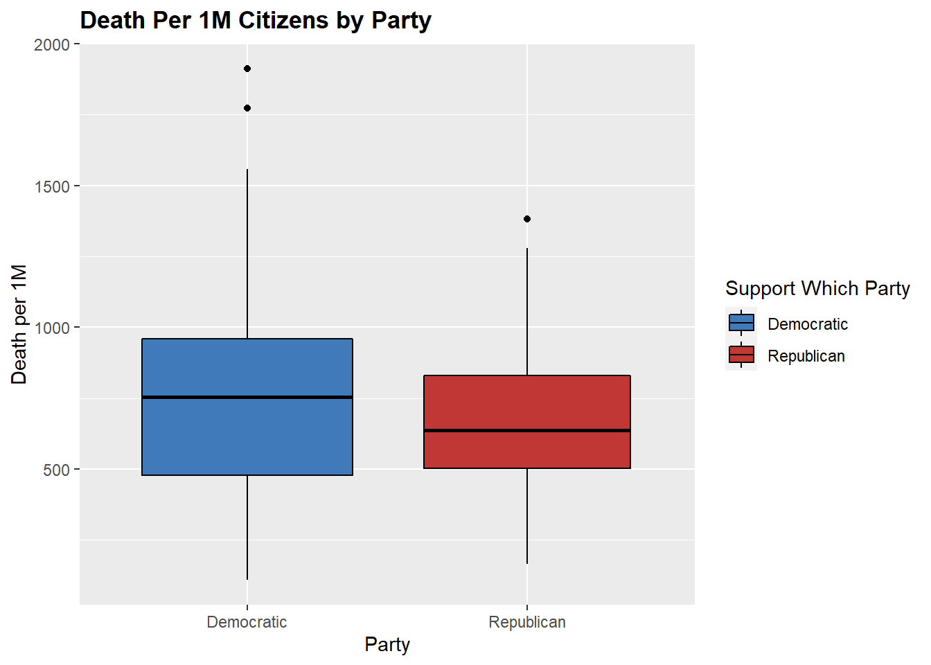
Now what about death rate, is there a visible relationship between that and the political affiliation?
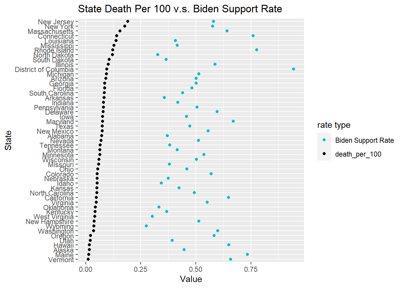
Here it doesn’t seem that there is a relationship between election results and Covid-19 death rate. This makes sense because we don’t expect the death from covid to be associated with political affiliation. We wonder if the health cost per captia of states plays a role here.
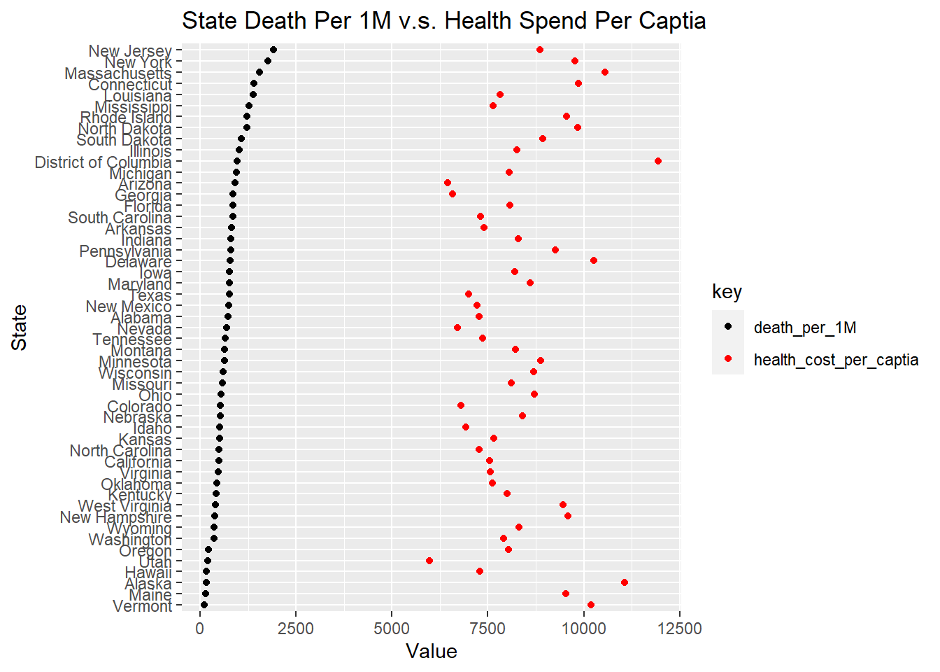
We also don’t find an interesting correlation here. There is no relationship between the health expenditure per captia for states and the covid death rate.
5.6 Plot Election Map
##        long      lat group order  region subregion
## 1 -87.46201 30.38968     1     1 alabama      <NA>
## 2 -87.48493 30.37249     1     2 alabama      <NA>
## 3 -87.52503 30.37249     1     3 alabama      <NA>
## 4 -87.53076 30.33239     1     4 alabama      <NA>
## 5 -87.57087 30.32665     1     5 alabama      <NA>
## 6 -87.58806 30.32665     1     6 alabama      <NA>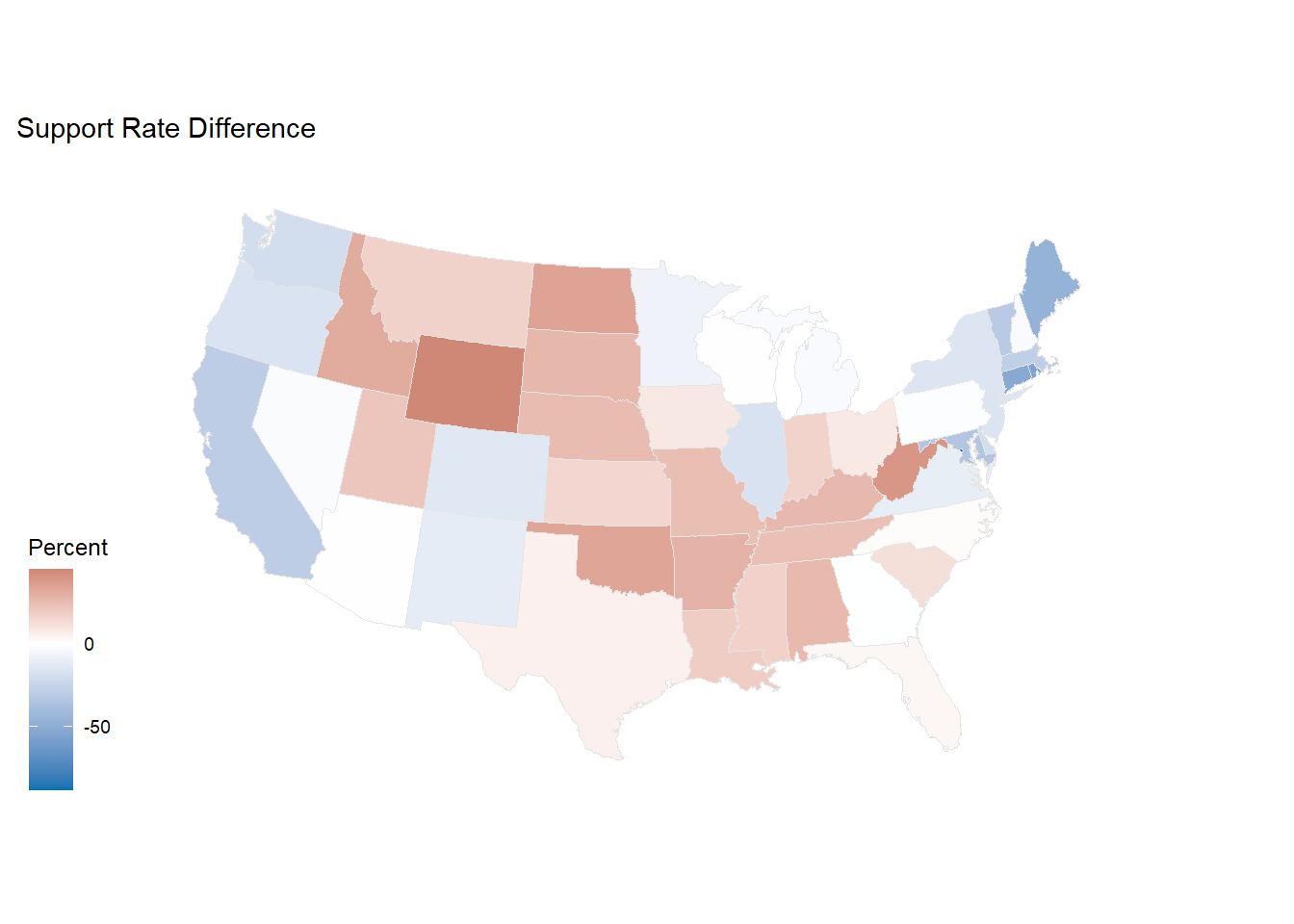
This map gives us a new perspective of viewing the political atmosphere in the United State currently rather than the simple red blue demarcation. Looking at the support rate difference between Biden and Trump, we could tell that the difference becomes more and more significant where it comes to the middle area in the U.S ( high difference of more than 10%). Both northeast and northwest hold the lowest difference around 2.5%. For the rest part of the U.S, the difference of support rate is around 5%.
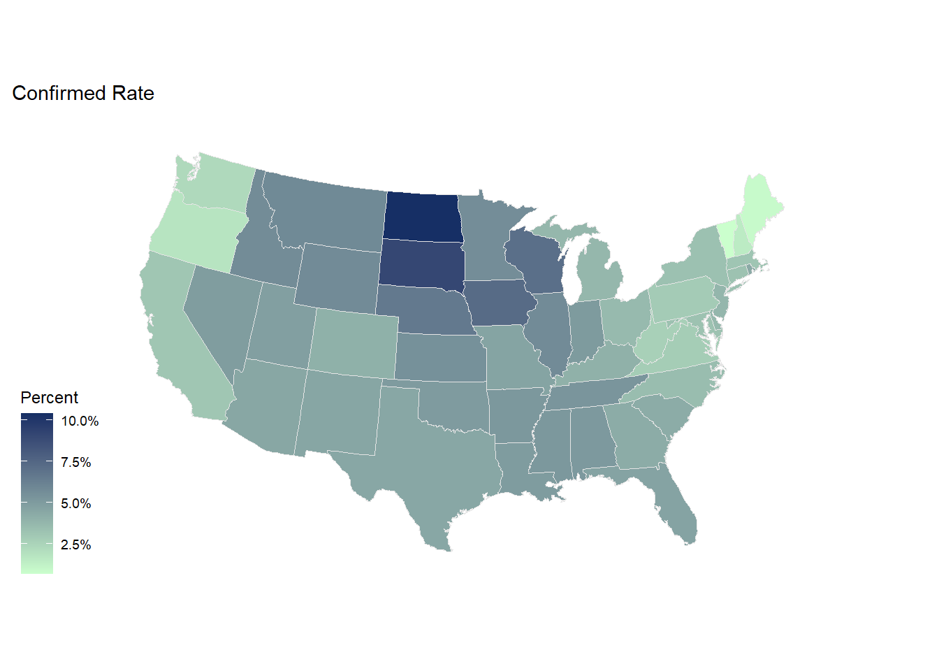
It is easy to see that high confirmed rate clustered in the middle of the map.